Imagine trying to read a full-length newspaper page that’s shrunk to the size of a novel book page. Or a 1920 px width webpage that’s rendered to a 460 px screen for display. Certainly not a welcome experience with the constant tapping, flicking and pinching that will be required to read the contents.
The necessity for a responsive or mobile friendly website was realized with the advent of smartphones and tablets many years back. While it was a “good to have” option in those days, the exploding popularity of mobile devices today has made it a “must have” feature of web design.
In today’s cross-platform consumer behaviour where information is consumed and commerce is transacted using a variety of on-the-go devices, an adaptive rendering of your website that’s aligned to the screen size of the device displaying it, is quintessential.
Let me explain why it is even more crucial now in 2014 and beyond.
Why is Responsive Design a “Must Have”
 Ask any webmaster about the trend of devices used by their website audience from their Google Analytics Dashboard. The answer will be – a rising trend of consumption through phones & tablets that’s probably surpassed desktop based access.
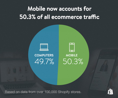
Still not convinced? Here’s a hard hitting fact – According to recently compiled data by hosted E-commerce provider Shopify, more people used phones & tablets to visit online stores than using computers. After looking at data from over 100,000 ecommerce stores that use the Shopify platform, they saw 50.3% of traffic coming from mobile (40.3% from mobile phones, 10% from tablets) and just 49.7% from computers!

So, if you are an Online Store owner whose website has yet to be made mobile friendly, then these figures should certainly be a wakeup call.
While improved customer experience and increased reach to a mobile audience would be a high priority item for any website owner, there are other benefits of having responsive design such as –
- Preferred for SEO purposes – Google cites responsive and mobile friendly design as one of the ranking factors for SEO
- Brand consistency across multiple platforms and devices
- Single set of content to be maintained
- Increased Conversions and Sales
Mobile Friendly Labels in SERPs
 Google has now officially launched “Mobile Friendly” labels as part of mobile SERP snippets. The label appears directly under the URL’s listed on Search results that are delivered in mobile browsers such as Safari, Android, etc. This gives users an early indication on whether the Search result they’d click on is mobile friendly or not.
This makes it all the more important that your site is compliant to the screens of handheld devices. To test if your website complies, you may want to use Google’s Mobile Friendly testing tool and also be aware of the guidelines and help resources available on Google Developers site.
Lastly, Mobile Usability reports have also been included in Google Webmaster Tools to help you track usability issues pertaining to the mobile user experience of your site. All these initiatives make it clear that Responsive Design is an important ranking factor in addition to providing a better UX to visitors.
Options for being Mobile Compliant
There’s a few ways you can consider for being relevant to a mobile loving audience –
1. Responsive Website
As mentioned, you can design your website such that its layout and content responds to the device on which its displayed. Primarily it requires 3 technical ingredients – Fluid Grids, Flexible Images and Media Queries. If your website is done on a CMS like WordPress or Joomla, most of the themes (website templates) available these days are responsive out-of-box so there’s no extra additional effort involved.
2. Dedicated Mobile Website
These are purpose built versions of the original website which are hosted at a new domain address (usually by adding ‘m’ before or after the original address, for example m.websell.com.sg)
The web server would recognise which device is being used and serves the appropriate site to display. Companies such as DudaMobile provide software for this option.
3. Mobile App
Mobile Apps are all the rage nowadays and need no introduction. These are programs that are saved on smartphone or tablet. They’re relatively small as compared with full websites and they tend to serve one function like reading articles, shopping, checking-in and so on. They have to designed, developed and maintained separately though.
Recommended Option
The ideal solution recommended is having a Responsive Website. You only need to build a single web presence that has the ability to render the same content dynamically based on the device that access it. It is the industry best practice and key advantages it offers are –
- Preferred for SEO consideration, recommended by Google
- Single Consistent Web presence for all devices
- Easier to manage
To sum it up, catering to a mobile audience is no more an option, but a necessity. To have that capability, a Responsive Website is the way to go!


Nice article!!!
Thanks for this….